Gulf Coast Weather Patterns
As a resident of the Gulf Coast, I am always interested in the weather patterns and natural environment that are constantly changing. I used the opportunities presented during my studies to examine the effects of weather and climate on the region. Below is a summary of content from research I presented as a large format poster.
Problem Description
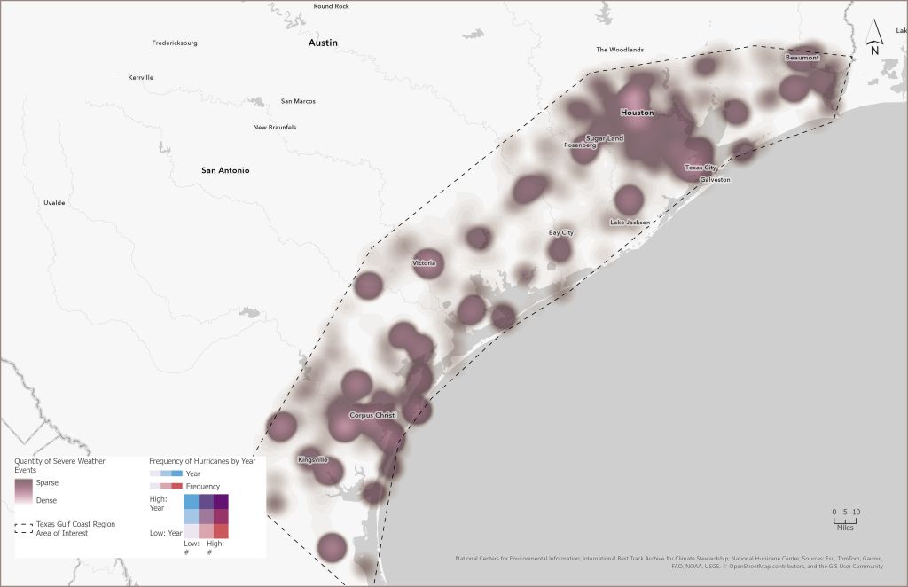
Coastal populations are vulnerable to extreme weather events. In recent decades the Texas Gulf Coast region has seen an increase in population and has also experienced intense weather events causing significant property loss, damage and loss of life.
Analysis Procedures
I wanted to evaluate the data to see if there was a trend of increasing intensity/frequency of significant weather events in the region of interest (shown on the map as the Texas Gulf Coast Region of Interest).
I collected publicly available data from NOAA (the National Oceanic and Atmospheric Administration), and the US Census Bureau.
I then used ArcGIS Pro to explore the data and various visualizations. I used the Data Engineering functions to visually understand the data and their relationships and create interactive charts. I used a basic overlay analysis to view the population data in the context of frequency of extreme weather events and I clipped the weather events data to the area of interest to focus my research.
Results
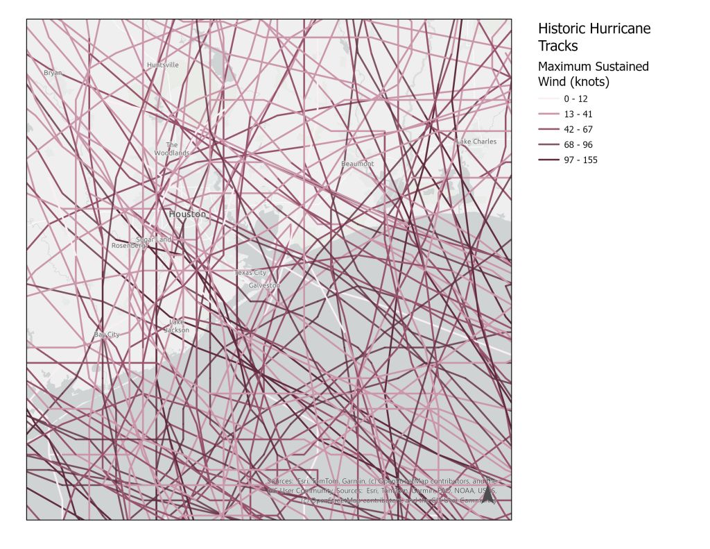
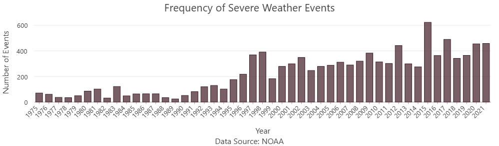
Reviewing hurricane track data (the lines shown on the map) I could see that the number of storms per year had increased from 2000-2012, as had the frequency of severe weather events. I created charts to show those changes.
Reflection
The region has seen an increase in population growth at the same time severe and dangerous weather events are becoming more common. Understanding the frequency and nature of these events will help residents and local governments to develop response plans and adapt behaviors to reduce risk and prevent loss of life.
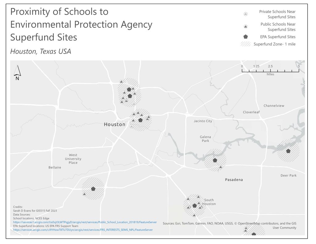
Proximity of Schools to EPA Superfund Sites
Problem Description
One of the more challenging aspects of cartographic design is creating visualizations in a monochromatic palette. The map below shows a large geographic region and uses scale and graphic symbols to differentiate information.
Analysis Procedures
I selected a region for the analysis and reviewed public data on school locations and EPA superfund sites. I then created a one-mile buffer zone around those sites and identified schools within those zones.
Results
The results shown here clearly depict the schools within the one-mile distance of an EPA superfund site. The buffer zone is shown as a merged, hashed bubble, the sites are shown as large octagons and the schools are shown with a traditional map symbol for schools. This image would be suitable for printing in a newspaper, or as a handout in a community information meeting.
Reflection
This project was an enjoyable challenge. Place the constraints of size and display on my map analysis made me see it in a different way, and I had to consider the symbology more thoughtfully than I would otherwise have done.
