Since my first introduction to GIS I have enjoyed the cartographic aspects of spatial analysis. In this program I practiced color theory, learned about design ratios and designing effective visual communication and I designed projects of varying scale for print and digital formats.
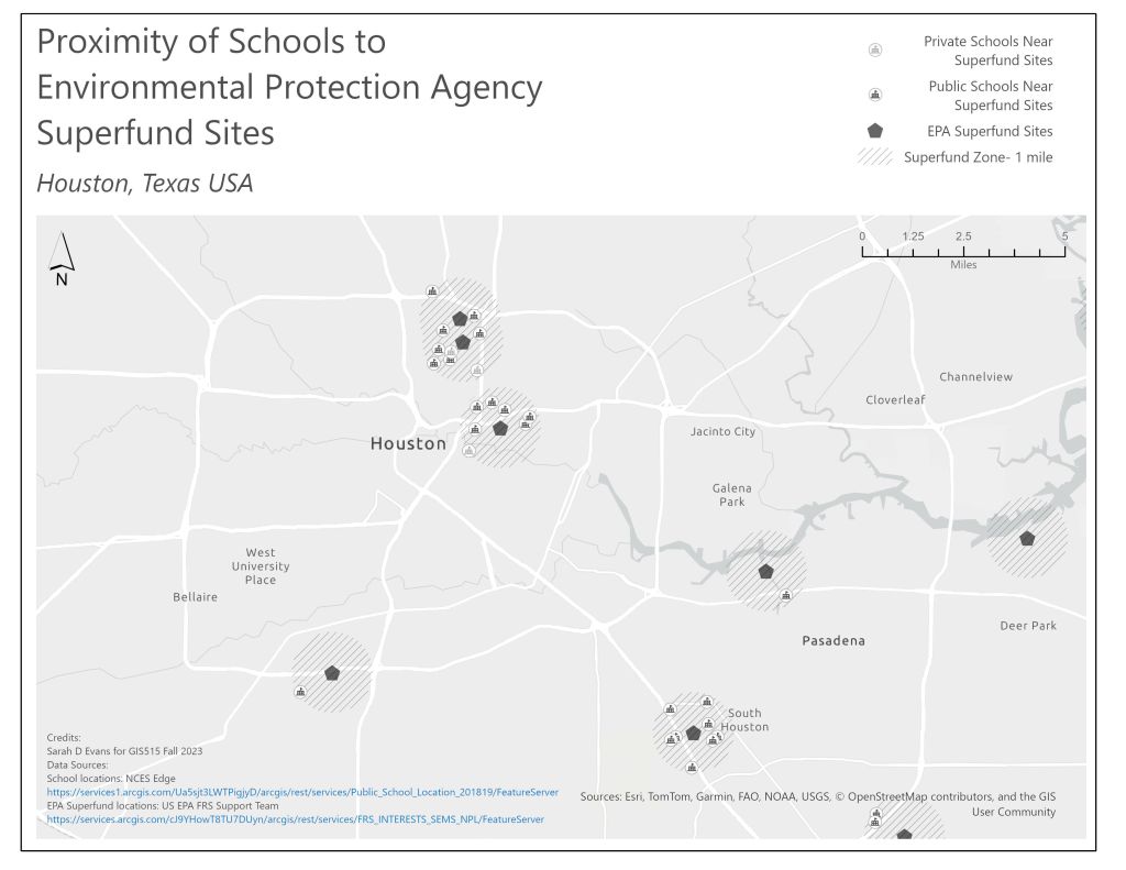
One of the more challenging aspects of cartographic design is creating visualizations in a monochromatic palette. The map below shows a large geographic region, and uses scale and graphic symbols to differentiate information.